
Lovely white is often the colour that confuses people the most.
At first, it sounds like the simplest decision in a kitchen renovation: "We’ll just do a white kitchen." It feels safe, timeless and easy to match. But once you start looking at cabinet samples, stone slabs, splashbacks, and wall colours, white suddenly becomes one of the most difficult choices in the whole design process.
That is because white is not really one single colour.
The same can be said about all colours, but we usually understand that naturally. When someone says red, green or blue, we already allow for lighter, darker, softer or deeper versions of that colour. With white, the default image in our mind is often much simpler. It can feel like one clean, standard colour until we begin comparing actual samples and realise how many variations exist.
There are warm whites, cool whites, neutral whites, creamy whites, grey-based whites, bright whites and soft whites.
The same white can look calm and elegant in one kitchen, but too cold, too yellow, too flat or too bright in another.
For a custom kitchen or joinery project, choosing white is not about picking the prettiest sample on its own. It is about choosing the right white in context.
At Renolux, we see white as part of the full design picture: cabinetry, benchtop, splashback, flooring, wall colour, natural light, artificial lighting, hardware and the overall feeling of the home.
White Is Not Just White
Each white has its own undertone.
Warm whites create a soft, inviting and timeless feel. With subtle yellow, peach or pink undertones, they are beautifully paired with timber flooring, natural stone, brass finishes and other warm materials. They are particularly well suited to rooms with limited natural light, helping to make the space feel warmer and more welcoming. However, if a warm white is paired with cooler materials, such as grey flooring or a cool-toned stone, it can appear more yellow than intended, so it is important to consider all surrounding finishes when selecting one.
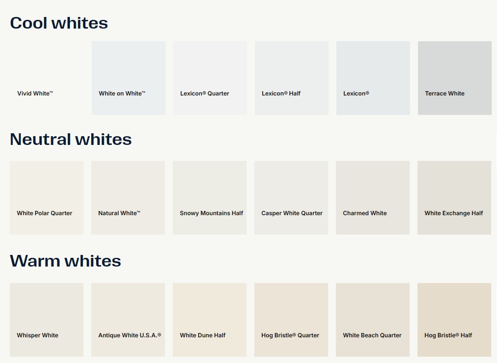
Cool whites create a crisp, modern and architectural feel. With subtle blue or grey undertones, they pair particularly well with minimalist joinery, grey stone, black tapware and contemporary interiors. They can also soften bright natural light and help a space feel more open and expansive. However, because they reflect light differently, cool whites can appear stark or clinical in some settings, making it important to consider the room’s orientation and lighting before choosing one.
Neutral whites sit between warm and cool whites, making them one of the most versatile choices for a wide range of interiors. They provide a balanced appearance with subtle warmth and excellent light reflection, making them easy to coordinate with many colours and materials. However, they still interact with their surroundings, so they should always be tested alongside your flooring, stone, cabinetry and lighting to ensure they achieve the desired look.
This is why two white samples can look almost identical on a small board, then feel completely different once they are used across a full kitchen.
Why White Changes from One Home to Another
White is highly affected by its surroundings.
A white cabinet beside warm oak flooring will not look the same as the same white cabinet beside polished concrete, grey tiles or a dark timber floor. A white door beside a creamy stone benchtop will not read the same as it does beside a cool marble-look surface. Even the colour temperature of lighting can shift the appearance of white.
Natural light also matters. A bright north-facing room can make whites feel cleaner and more open, while a darker room may make some whites appear duller or heavier. Afternoon light can warm up a white, while cooler daylight can bring out blue or grey undertones.
This is why choosing white from a phone screen, a brochure or a small sample alone can be misleading. White needs to be viewed beside the actual materials that will sit around it.
Famous Whites Homeowners Often Hear About
When clients begin researching white kitchens, they often come across well-known white names from different paint and surface brands. These names are useful references, but they should not be chosen in isolation.
From Dulux, homeowners often hear names such as Natural White, Antique White U.S.A., Lexicon Quarter and Vivid White. Dulux lists Natural White, Antique White U.S.A. and Lexicon Quarter among Australia’s favourite whites, with Natural White described as a neutral white with subtle warmth, Antique White U.S.A. as warm, and Lexicon Quarter as a cooler white direction. Vivid White is also widely referenced as a clean, bright white option in Dulux’s white range.
From Taubmans, Crisp White and Cradle White are common names clients may come across. Taubmans describes Crisp White as a clean, delicate white with soft undertones, and also discusses Crisp White and Cradle White in its guidance on choosing white paint colours.
From Polytec, which is commonly used for cabinetry, doors, panels and joinery surfaces, names such as Classic White, Blossom White, Gossamer White and Aston White are useful to know. In Polytec’s own colour selection guidance, Gossamer White is described as having a beige undertone, Blossom White is described as flexible across warm and cool projects, and Aston White is described as a cooler white choice.
From Porter’s Paints, Popcorn and Snow White are two recognisable whites. Porter’s lists both Popcorn and Snow White in its Whites and Off-whites range. Porter’s describes Popcorn as "the perfect classic natural white" and very neutral in tone, while Snow White is listed as a popular white with a high LRV value.
These examples show the point clearly: to a homeowner, they may all simply look like "white." In a finished kitchen, each one can create a different atmosphere.
How to Choose the Right White for Your Kitchen
The safest way to choose white is not to choose it alone.
Place the cabinet sample beside the benchtop, splashback, floor sample, wall paint and hardware. Look at the combination in natural light and artificial light. Compare the sample vertically, because cabinet doors are vertical surfaces, not flat horizontal ones. A colour can look different depending on how light hits it.
Also consider scale. A small white sample may look subtle, but across a full wall of cabinetry it becomes much stronger. What feels "just warm enough" on a sample may feel too creamy across an entire kitchen. What feels clean on a small sample may feel too cold once installed.
This is where a showroom and design process become valuable. The goal is not simply to pick a white. The goal is to build a palette that works as a whole.
The Renolux Approach
At Renolux, we do not treat white as a default option. We treat it as a design decision.
A white kitchen can be bright, soft, classic, modern, warm, minimal or architectural. The final result depends on the shade of white, the sheen, the joinery profile, the stone, the flooring, the handles, the lighting and the way all of those elements work together.
That is why the right white is not chosen from a single sample. It is chosen through the design process.
Because when white is done well, it does not feel plain. It feels calm, considered and beautifully integrated.